Here is my attempt at explaining graphs in Physics, and what they are for.
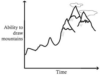 |
| Ability to draw mountains over time |
You can tell that as time gets larger (that is as we move further away from time zero in this experiment) Dmetri's ability gets better. The thing that changes in this experiment is time so we put that on the x-axis and plot the thing we are measuring against the thing that changes on the y-axis. We can call these the independent and dependant variables if we like, but I wont. We could even start to make some predictions about Dmetri's mountain drawing abilities for some time further down the track, or we could draw a line of best fit through his data points in order to get an equation for his graph.
I see this as one of the main points for doing Physics. We do it to get data points that we can tabulate. Then we graph the tabulated data and from that graph, make predictions and fit equations. Once we have the equation for the graph, then we don't have to do the experiment again and in fact we can rearrange or manipulate the equation for our purposes.
 |
| Hertzsprung-Russell Diagram |
This graph however, is so much more than that. We know that stars evolve and as they get older they change their composition therefore change their temperature, which in turn will change their luminosity. This effectively means that the HR diagram is a plot of the life cycle of star. I can make predictions too. Tell the colour or luminosity of a star and I can tell you what sort if star it is and wether it is likely to go Supernova in it's lifetime or not. Pretty cool little graph.
I use graphs all the time to convey messages, i think they hold an immense power to communicate an experiment or outcome. If maths and equations are the language of Physics, then graphs are its poetry.
No comments:
Post a Comment